

4th Annual Off-Season Study Guide: 2025 FBS Season
Here's who you should be studying this offseason at the college level.

As the year comes to a close, the race for next season begins. Coaches are already looking for answers, but with so much information out there and regional or media biases, it can be tough to decide who to focus on. That’s where MatchQuarters steps in.
It is time to skip outdated box score stats like “Total Yards” and focus on what actually matters: efficiency.
One of my main goals with MatchQuarters is to help you expand your search beyond your region or favorite college defensive coordinator. We all operate in different ecosystems with varying program sizes, and often, the best ideas come from stepping outside your comfort zone.
When evaluating defenses, I focus mainly on efficiency. In the NFL, I look at DVOA; in college, I rely on Brian Fremeau’s BCF Toys (FEI). However, I also hunt for teams that “do more with less.” Because FEI weighs schedule strength heavily, G5 teams are often ranked lower than their Power 4 counterparts—yet the G5 is frequently where you find the most schematic creativity. That’s why I always cross-check efficiency with raw EPA.
Toledo anyone?! I think I’ve covered them before…

This year’s 4th Annual Study Guide is designed to let you dig deep into the film you need to watch, regardless of conference affiliation.
For example, do you want to run more simulated pressures next year?
Scroll down to the interactive Blitz Data, sort by Sim%, and you’ll see Florida (Ron Roberts) and Indiana (Bryant Haines) leading the way. But were they effective? Roberts, the godfather of Creepers, had the Gators 37th in DFEI, while Haines’ Indiana squad finished 3rd.
You can gain further insights by contextualizing the volume of data. New Mexico State is recognized as a top-10 simulation team, yet they only blitzed 22% of the time. So if you are looking to watch a team that runs Sims at volume, you’d be better off watching a team like UConn, which has a high Blitz Rate (44.6%) and a high Sim% (51%).
The information in this year’s Study Guide provides you with a deeper understanding, enabling you to ask informed questions when watching film or discussing strategies with coaches at clinics.
Best of all, this year’s charts are fully interactive. You aren’t limited to a “Top 5”—you get data on all 136 teams.
There is schematic diversity everywhere in college football; you just have to look.
—


A powerful platform used on Microsoft® Visio & PowerPoint to allow football coaches to organize, format, and export Playbooks, Scout Cards, and Presentations efficiently.
Below, I identify key categories for analyzing defenses. These include everything from FEI to coverage schemes and blitz rates. I have compiled Top-5 lists for most categories. You may notice some names appear repeatedly, which is common for top units. I omitted the front structures since more teams now run multiple fronts or hybrid spacing. However, the ‘old’ standards are still included, like Pitt (Over), Iowa (Under), Army (East Coast 3-4), and Iowa State (3-High).
» College content from this past season:


—
Is Complexity a Crutch? (Diversity vs. EPA)
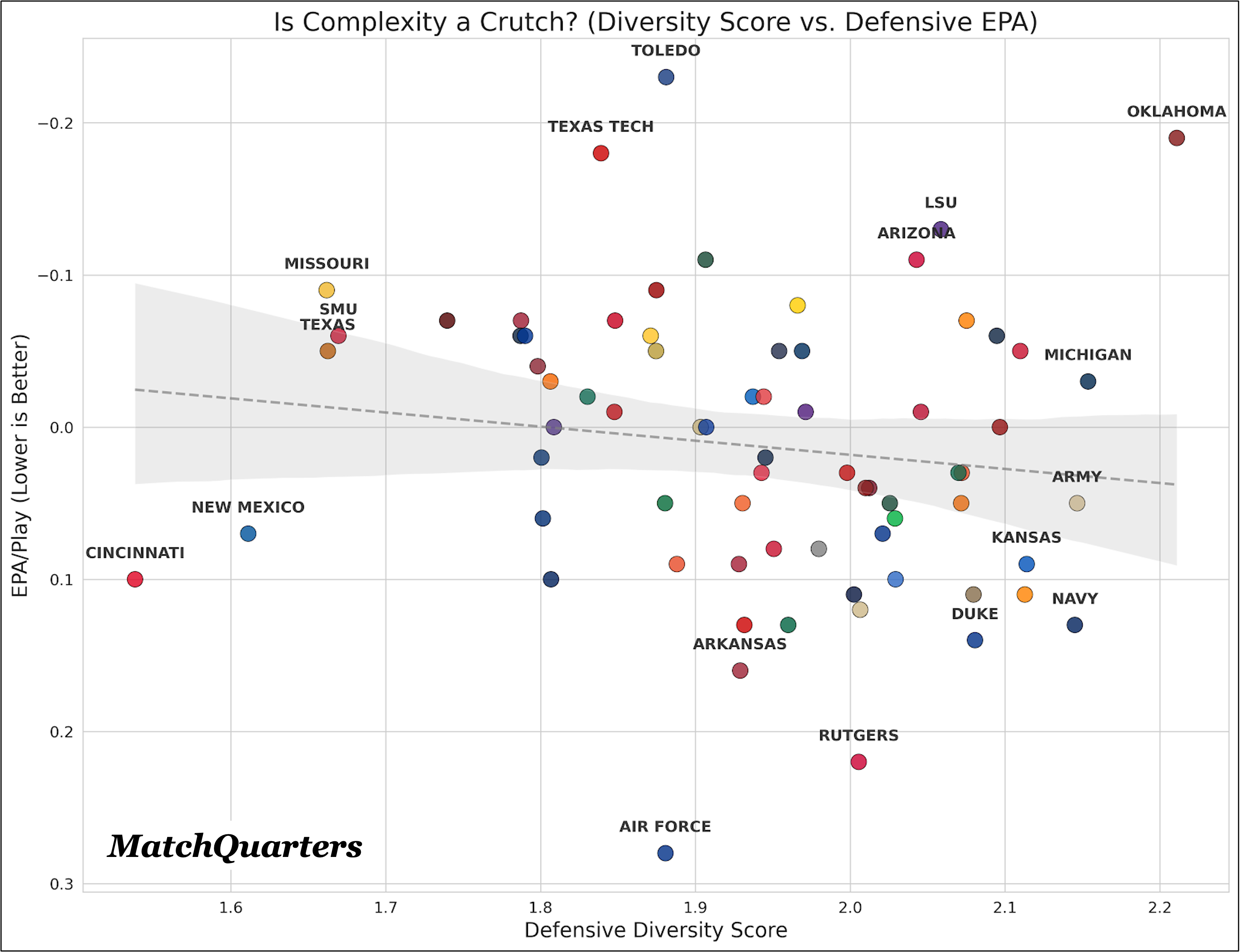
Insight: There is a slight negative correlation between scheme diversity and success. In other words, “doing more” often yields less. The trend line suggests that as defenses get more complex (higher scores), their efficiency (EPA/Play) declines slightly.
The “Zen Master” (Simple & Elite): Toledo
Chart Position: Far Left (Low Diversity), Top (Elite EPA).
The Data: Toledo has one of the lowest diversity scores (1.88) because it rarely blitzes (26.5%). They rely on winning with a standard 4-man rush and playing sound coverage. The result? The #1 Defensive EPA (-0.23) in the nation. They prove you don’t need to trick the QB if you can just beat the guy in front of you.
The “Mad Scientist” (Complex & Elite): Oklahoma
Chart Position: Far Right (High Diversity), Top (Elite EPA).
The Data: Oklahoma is the outlier that proves the rule. They have the highest Diversity Score (2.21) of any elite defense. They blitz 50% of the time and mix coverages evenly. Unlike most teams that try this and fail, Oklahoma executes the chaos perfectly, landing them at #2 in Defensive EPA (-0.19).
The “Crutch” (Complex & Struggling): Rutgers
Chart Position: High Right (High Diversity), Bottom (Poor EPA).
The Data: Rutgers runs a highly complex scheme with a Diversity Score of 2.01 (top 20% in complexity), yet they surrender a dismal 0.22 EPA/Play. This perfectly illustrates the “Complexity Trap”: instead of confusing the offense, the constant shifting is likely leading to blown assignments and big plays by their own players.
—
Chaos Kills Drives (Havoc vs. 3rd Down)
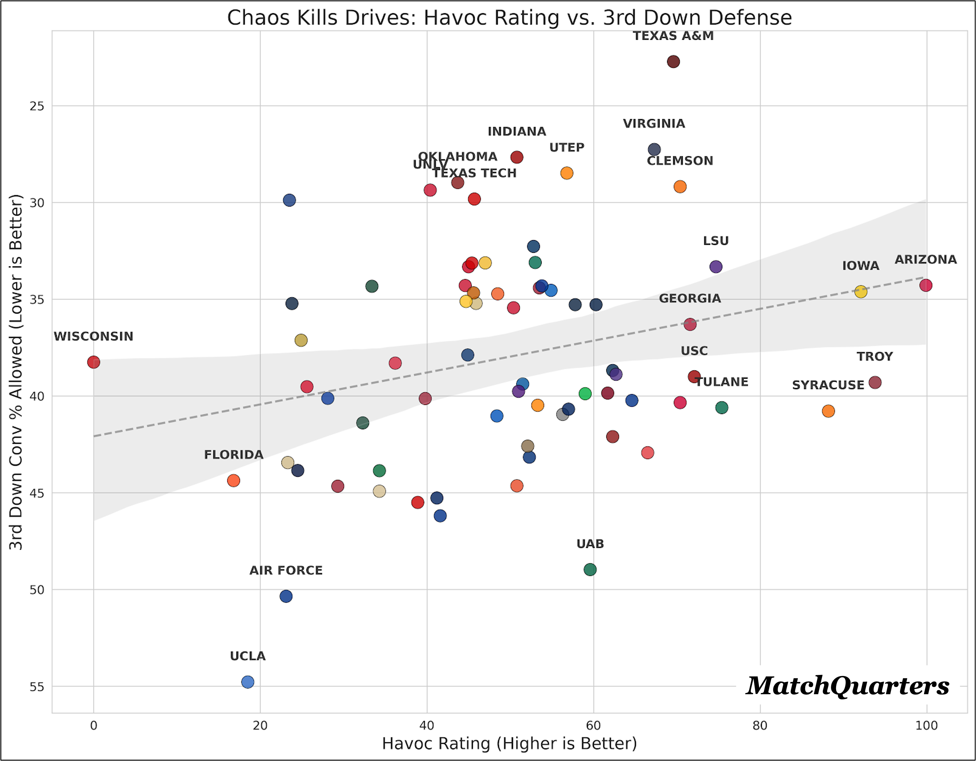
The Insight: “Havoc” (TFLs, Forced Fumbles, PBUs, INTs) is the primary driver of 3rd Down success. If you can create negative plays on 1st and 2nd down, 3rd down becomes easy.
The “Agent of Chaos”: Arizona
Chart Position: Far Right (Max Havoc), Top (Elite 3rd Down).
The Data: Arizona is in a league of its own with a 99.9 Havoc Rating. This creates unmanageable 3rd-and-long situations, allowing them to hold opponents to a stifling 34.3% conversion rate on 3rd down.
The “Safe & Sound”: Iowa
Chart Position: High Right (High Havoc), Top (Elite 3rd Down).
The Data: Iowa is famous for “boring” defense, but it's actually an elite chaos creator (92.1 Havoc Rating). They don’t gamble; they just tackle well and strip the ball, resulting in an elite 34.6% 3rd-down defense.
—
Pressure Bursts Pipes (Pressure Rate vs. EPA)
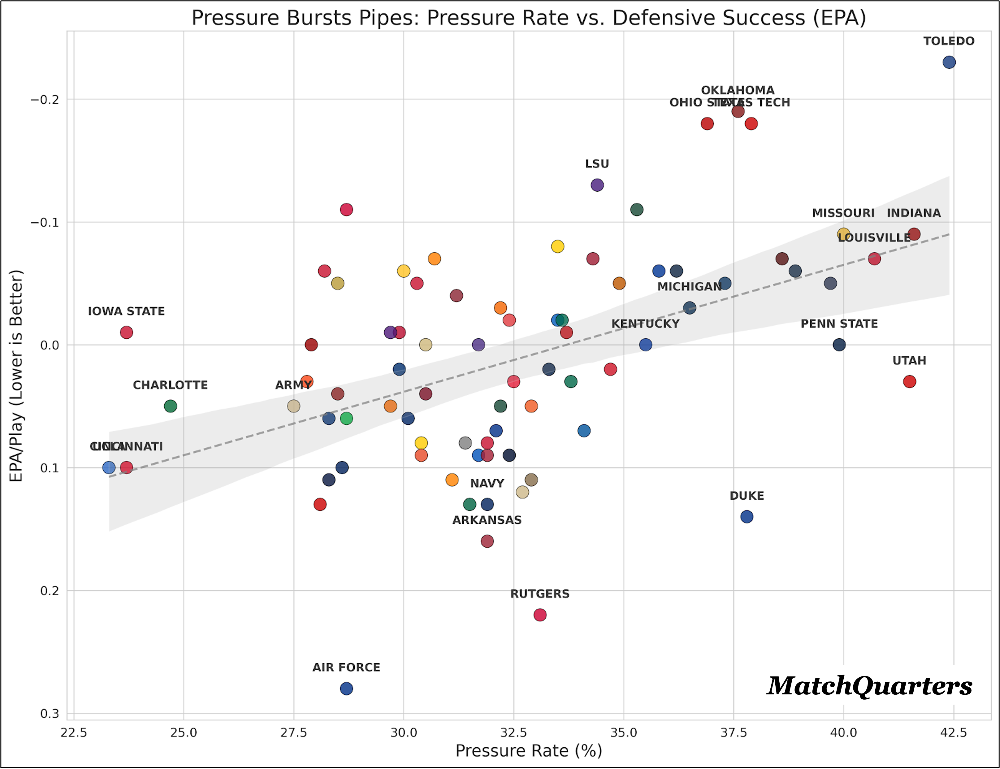
The Insight: While sacks are flashy, consistent pressure (making the QB uncomfortable) is what truly drives defensive efficiency. The chart shows a strong linear relationship: as Pressure Rate increases (moves to the right), Defensive EPA improves significantly (moves up).
The Elite Standard: Toledo & Ohio State
Chart Position: Top Right (Elite Pressure & Elite EPA).
The Data: Toledo is an anomaly here—previously highlighted for its low blitz rate, it actually has the highest Pressure Rate (42.4%) in the country. This means their front four is winning organically without needing to send extra bodies. Similarly, Ohio State generates pressure on 36.9% of dropbacks, allowing them to sit back in coverage and strangle opponents.
The “Glass Cannons”: Duke & Utah
Chart Position: Bottom Right (Elite Pressure, Poor EPA).
The Data: Duke and Utah generate elite pressure numbers (Duke: 37.8%; Utah: 41.5%), yet they have positive (bad) EPA/Play. This suggests that when they don’t get home, their secondary is getting exposed. They are “boom or bust” defenses—high risk, high reward, but ultimately inefficient.
The “Coverage Kings”: Air Force
Chart Position: Top Left (Low Pressure, Good EPA).
The Data: Air Force sits in the “low pressure” zone but maintains a respectable EPA. This reinforces their profile as a coverage-first team that forces QBs to hold the ball (long Time to Pressure) and make mistakes downfield, rather than relying on the pass rush to disrupt the play immediately.
This chart completes our defensive picture: Sacks finish drives, Havoc kills 3rd downs, but Consistent Pressure drives down-to-down efficiency.
—
» All the charts below have all 136 teams, are searchable, and interactive.
Now, get to studying!
